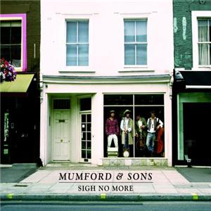
I researched different artists album artwork & digipaks to give me an insight into what type of designs are used and how they have used images, colours, shot distance, framing etc.
This album cover shows an ELS of a building/shop with the band members in the window, whilst the long shot detracts attention away from the image of the band, the use of colour allows the members to be seen more clearly. The use of pale greens, creams etc. create a quite natural atmosphere, connoting the style of the music, as it's fairly calm. The image of the band is slightly off centre, meaning that the audiences attention is diverted to the doorway and flat. The text of 'Mumford & Sons' is quite plain and traditional, displaying the bands name is a larger and italic font, with the album name in a smaller and non-italic style; this denotes the importance of the bands name over the album name, suggesting the audience may be drawn to the album as a result of the clear font style.
Bon Iver Album Cover
This album cover is more simplistic than the Mumford & Sons album cover, as there is only one image, which is almost fully covered up. The image of a tree connotes a quite dark and depressing feel to the album, whilst the covering up further connotes this atmosphere. The use of dark colours reiterates the differences between this album cover and the Mumford & Sons album, whilst also highlighting the difference in their style of music, as Bon Iver aren't as upbeat and cheerful. By positioning the image of the tree to the right of the album cover, the audience is attracted to the text on the top left. Similar to Mumford & Sons, the bands name is written in a larger and quite traditional font. The text album name is written in a hand-written and italic style, connoting that the album is quite personal.


No comments:
Post a Comment