Friday 30 March 2012

Final Music Video

Using the feedback from my peers and teachers I've been able to complete my final music video; I think that the changes I've made such as increasing the amount of lip syncing and removing irrelevant/confusing shots such as the 'horse shot' has made my video more accessible for the audience and overall of a better quality. As well as this, by using more transitions within my production it allowed the connection between shots to be seen, thus allowing some shots to mirror the lyrics of the song and identify with the conceptual element of the music video.

Friday 16 March 2012

Final ancillary texts


Digipak Changes:
- I added more spines to my digipak as I had been informed that there needs to be a spine on each side
- I added the artists name onto bot spines as it was apparent that many digipaks do this to further promote the artist, and make it clear as to where the opening of the digipak is

Magazine Advert Changes:
- I added a drop shadow to the font to make it stand out above the image
- I included a date below the artist name and song name to make it clear to the audience when it's available
- As the image on the magazine was different to the album cover, I added an image of the album in the corner of the advert to create synergy between my ancillary texts
- I also added a drop shadow to the image so it stood out more, this was important as the audience need to be able to recognise what the album looks like


Tuesday 13 March 2012

Progression

Despite the fact I feared I was steering away from the conceptual-based video I had desired to do at the beginning, I feel that as my knowledge has increased I'm much more comfortable with using/developing the forms and conventions of conceptual based videos.
It was apparent that before the completion of my first draft I felt as though I needed a storyline for it to be successful, however I think allowing myself to gain feedback from others really improved my understanding as I realised it could still be successful without a storyline. My first draft demonstrated this, as it didn't follow a storyline yet the audience could understand there was meaning behind the arrangement of shots and editing. This was further connoted through the shots of nature, as my video followed an idea rather than a narrative. I think this was a significant learning curve, because as I'm nearing the completion of my final product I feel comfortable with understanding the conventions of the indie-folk genre as well as the types of music video. However, this suggests that maybe I should have done more research into the types of music videos earlier on in the planning process to ensure I had a deeper knowledge as I was entering the construction stages.

Sunday 11 March 2012

Developed Ideas


Digipak:
- I was encouraged to combine images from all of my digipak drafts in order to create a better quality digipak
- I also added a spine between front cover and back cover to connect the shots as it's essential to have a spine
-

Magaizne Advert:
- I changed the brightness of the image as the face had lost all definition on one side
- I changed the font to a more structured font to make it look less amateur
- I included her website at the bottom as it would give the audience more options on how to retrieve the song
- I do think I should include a date of sale for the song as there's no indication of when it's available 

Filming 11/03

As a result of further mishaps in the weather, my original shooting plan didn't work out so I had to film all of my reshoots and new shots on this day.
I feel this was my most successful shoot because as I'm nearing the completion of my product I feel much more comfortable in planning ahead and accordingly. This filming session was to obtain all lip syncing shots of my actress, as well as any reshoots. Following this I decided to get my nature shots as it was apparent that the shots I used in my first draft were too dull and dreary compared to the rest of my music video. I specifically focused on getting a range of shots of my actress on the bridge, as this location was favoured by those who watched my music video. As well as this, I made sure I redid the shots of my actress that were much darker than the majority of the shots due to poor weather conditions; I've done this to keep continuity throughout the video, and to avoid it looking rushed. Despite feeling positive about this shoot, I'm going to wait until I've finished editing to conclude my filming session. I'm hoping that it worked out well as the deadline is Tuesday 13th meaning I won't have much time to correct my mistakes.

Friday 2 March 2012

Developed Ideas - Plan

The feedback on my digipak and magazine adverts has helped me a lot, as I now know what I need to improve in order to have a successful final draft.


Magazine Adverts - http://heathercaseya2mediacoursework.blogspot.com/2012/02/magazine-ad-first-draft.html
Magazine Advert 1:
  • Good choice of font - sophisticated
  • Image may not be right for the magazine advert, needs to relate more to the artist/video
Magazine Advert 2:
  • Font is slightly too casual, doesn't support the serious tone of the song
  • Nicely shot image, however is it too dull and horror-like?
  • Text is clear and obvious
Magazine Advert 3:
  • Image of the artist is well shot and positioned
  • Beneficial to use a shot that reflects the opening of the video
  • Too light - definition in face is almost completely lost on the left side
  • Text isn't as clear as the other adverts, rethink font and colour
Magazine Advert 4:
  • Well shot image - bridge and trees
  • Text is too small and hard to see
  • Text is positioned well
Digipaks - http://heathercaseya2mediacoursework.blogspot.com/2012/02/digipak-first-draft.html
Digipak 1:
  • Shot and positioning of the artist works well
  • Front cover image could be bolder and reflect the artist and song more
  • Some shots link together more than others 
  • Shot of the leaves is good - eerie  
Digipak 2:
  • Left cover, back inside and cover inside images link much better than the first advert
  • Front cover shot connotes the themes of the song
  • Left cover image of branches is slightly random
Having gained feedback on my drafted ancilliary texts, I've realised that I'm going to keep the shots I'm using at the moment, however rearrange them and continue to play around with the designs. For my magazine advert, I'm going to particularly focus on the images used in Advert 3 and Advert 4 as these seemed to be the most well received adverts. For the digipak I'm going to reorder my images in a way that they link together nicely, combining shots from both digipaks and removing images that are less effective. If I am still unable to achieve successful ancillary texts I will get some more images that may be more effective.

Monday 27 February 2012

New Plan

What do I need to do next?
- Reshoot lip syncing shots
- Shoot more lip syncing shots 0:51, 1:29, 2:17, 2:28, 2:57, 3:13, 3:27
- Reshoot shots of nature - original shots are too dull and dark

Dates
28/02 - lip syncing/footage of singer
By filming my actress before I film the footage of nature, I'll be able to edit these promptly and make sure they're suitable to use in my final piece. If unfortunately they aren't at a suitable standard, I can arrange another filming session early before the deadline in order to allow myself enough time to edit and complete it.
06/02 - shots of nature
I have chosen to shoot these shots on this day as I'm definitely free, however if I become free on an earlier date I'll shoot them before. As I don't need anyone to help me shoot these I'm less worried about when to gain these shots as I can get them whenever I'm available and have access to equipment. However, these shots need to be taken on a sunny day, as my specific intention is to gain brighter and more enticing shots.
13/02 - draft of media evaluation & final edits to practical work

Friday 24 February 2012

Feedback continued


Feedback

I thought it would be a good idea to go through my music video and annotate print screens of the changes I need to make rather than listing them. This will be beneficial for me as I will be able to directly refer to the specific points within the music video I need to address.


Tuesday 21 February 2012

Music Video - First Draft


Having completed the first draft of my music video, I feel as though my music video is beginnning to look more like a music video rather than a random sequence of shots; the use of lip syncing has really improved my video, as it now has more depth and is much easier to understand. Whilst I am quite pleased with the outcome of my first draft, there is still room for improvement. Having analysed the content and made my own assumptions of what needs improving, I've gained feedback from my teacher and a few peers in order to improve the final draft.

My initial thoughts:
  • More lip syncing shots
  • More close ups of nature, possibly contrast shots of autumn nature with spring/summer nature
  • Lighting - some shots are darker than others
  • Minor continuity error - actress is wearing different shorts in some shots
Feedback
  • Style fits with the song
  • Use more shots of horses or remove them altogether 
  • More shots at the bridge
  • Clearly presents an abstract style 
  • Shot as actress comes from below the branches is nice 0:30
  • Good choice of angle and lighting 1:38
  • Have actress expressing emotions of the song through facial expressions/body language 
  • More lip syncing shots
  • Use more effects such as cross dissolves

Friday 17 February 2012

Magazine Ad First Drafts


This was my first attempt at creating my magazine advert, whilst I think it depicts the theme of nature well, I'm unsure as to whether the image of the tree is bold enough to represent and promote the  artist and the song. I edited the image in photoshop to give it a slightly blurred effect, and I played around with the brightness and contrast to really emphasise the autumn season. I quite liked the pale pink/cream font as it wasn't as bold as a colour such as black and white, and I felt it went well with the oranges and greens. However, I wasn't too sure on the font I had chosen as it seemed to rigid for the style I was aiming for, previous research of Gabrielle Aplin's style (Gabrielle Aplin's EP's) suggested her fonts are much more playful and personal, and I feel this font is too informative.


I think I prefer my second attempt to my first, as the image is much bolder as the location and the thick branches above the writing clearly represent the melancholic tone of the song. The black and white rustic effect connoted the themes well, as it's quite spooky yet in keeping with nature, thus represents the song 'Ghosts' well. I decided to change the font to give a slightly handwritten effect, highlighting the profundity and importance of the song.


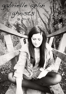
Having made two attempts of making a magazine advert based around an image of a location, I wanted to see what it wold be like to use my actress as the main image for the article. I used the same effect yet a little lighter as I felt this connoted the themes well. I'm quite fond of the image of the artist I've used as I think the facial expression denotes her emotions well, whilst the location represents the themes of nature. I also liked this image as when the lyrics start in the music video it features the artist sitting in this position, thus making it iconic. Whilst I like the font I feel that it may be a bit dark for the image and difficult to notice, so I may need to have a few more attempts until I reach a final draft.
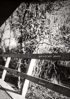
I hadn't planned to create a magazine advert like this, however when I came across the image I had an idea for it so I decided to see what the outcome would be. I particularly liked this location and it features quite a bit in my drafted music video so I've become quite attached to it. I feel that the image of the bridge connotes loneliness whilst the bundle of branches connotes confusion, which is what the song seems to depict. I was unsure of where to put the writing in order for it to be seen, so I decided to place it on the bridge in a white font to make it stand out. I think it may be a bit small as the image is quite a 'busy' image so it may need enlarging. However, I'm beginning to think that this font could be too playful, and a more structured font like the font used in the first digipak may be more beneficial to use.


At the moment I'm unsure of my favourite magazine advert, I'm going to gain some feedback from my audience and teacher in order to help me come to a conclusion.
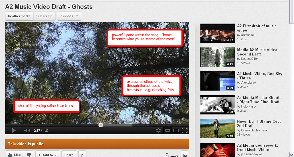
Digipak First Drafts

  This is my first digipak design, I quite like the front cover image as by positioning the artist on the left side, the name and song can be clearly seen in the right hand corner. I wasn't too sure about the both of the left cover images and whether they look a bit random or if they're in keeping with the style - I'm going to gain audience/teacher feedback in order to improve. I stretched the image of the feet from the inside cover onto the back inside cover as I felt they linked in well. I managed to change the opacity of the image on the back inside cover, and change the colour of the CD to black in order to make it obvious where the CD would go.
This was my second attempt at the digipak, I used a similar style with a different set of images in order to gain a different perspective. The front cover image creates quite a spooky atmosphere, as the artist appears 'ghost-like' herself, this allowed the title to position well next the image of her. I feel as though this digipak had a less scary tone to it, as the it's images of clouds etc. 

I'm going to gain feedback to help me establish what design I want to use, however I may create some more digipaks using coloured images rather than black and white to see if they're more successful. 

Thursday 16 February 2012

Filming & Editing 19/02 - 20/02

As the snow had completely cleared by this date and the weather was looking much better I felt it was a suitable time to film. In this filming session my main priority was gaining lip syncing shots as having no lip syncing has been hindering the likeability of my video, causing it to be confusing and misunderstood. I feel this filming session went well as I was able to gain some lip syncing shots of particularly important lines in the song. However, a slight issue I came across was the brightness of the sun as in some shots it made my actress look very pale and denoted a summer season rather than a spring/autumn. To overcome this, if the sun was extremely bright I moved onto other shots that weren't facing towards the light, and filmed the previous shot when the weather was suitable.

Having edited my lip syncing shots into my video I'm beginning to feel more comfortable with my music video, as I've now been able to understand the importance of lip syncing in order to understand/connect with the artist/actress and the themes presented within the song. However, whilst I feel that I've gained a better understanding of the conventions of a music video, I think that more lip syncing shots would be beneficial, as I still feel like it could be lacking in something. Another improvement I feel I could make is gaining some more still shots of my actress, as for the time being I have reused shots in order to avoid any gaps. The lack of storyline appears to be a problem, as whilst I wanted to create a conceptual based video, I feel as though the conceptual idea isn't powerful enough to make my video successful. Thus, I may need to rethink the narrative of it, in order for it to make sense. Having finished the first draft of my music video, I'm going to gain feedback and advice from my teacher and peers, in order to have a successful and completed final draft.

Sunday 12 February 2012

Magazine Advert Research

I felt that my magazine advert research was quite limited, so I decided to do quite a broad research into how magazine advertising works, in order to give me some ideas. http://www.consterdine.com/articlefiles/42/HMAW5.pdf
I found this PDF file online 'How Magazine Advertising Works' which targets all types of magazine adverts and I've found it really useful. Here are some printscreens of what I found:


Saturday 11 February 2012

To do list

1. Tuesday 21st February - All practical work to be submitted for 'formative assessment'. You may be asked to make further edits after this.

Music Promo: Music Video, Digipack and Advertisement
2. Tuesday 13th March - First draft of Evaluation and all final edits made (as advised) to practical work.

3. Wednesday 28th March - Final draft of Evaluation (uploaded to blog), all practical work uploaded to blog and any gaps in research/planning filled.


I felt comfortable with these deadlines when we were first given them, however due to the recent mishaps in the weather I'm beginning to worry about the little time I have left. 
Whilst I feel that it's impossible to film in the snow as my music video is wholly outdoors and all of my shots denote autumn, I'm starting to think that some images of the snowy weather could be really effective for my digipak and magazine advertisement. As nature is a key theme for my product, if my music video denotes winter through my selection of shots, it may be beneficial for my digipak to denote winter through snowy images. I'm going to produce a range of shots in the weather at the moment to test out the images - I'm also wondering if a black and white effect would be good as well. 

To make sure I don't fall behind too much I'm going to put a lot of my focus into my digipak and magazine advertisement until the weather is suitable conditions to film in. However, if the weather doesn't improve soon I'm going to reshoot everything in the weather as it stands, as this will still connote the themes and ideas I'm wanting to portray. 

Tuesday 7 February 2012

Snow 4/02

Due to the recent change in weather my filming has unfortunately come to a halt for the time being. I'm having to wait until the snow has gone before I can complete my filming, as I want to avoid any continuity errors in my product and I fear that even by carefully filming to avoid recording the snow, I will somehow have snow within my music video and I want to avoid this at all costs. I was considering re shooting the music video using the snowy weather as a new setting as it would clearly connote the nature theme I'm following, however the possibility of the snow melting quickly is vast, thus I don't want to risk losing a lot of footage. Whilst waiting for the weather to improve it will give me more time to improve my plan and think through my next steps, as well as this I can begin the designing of my digipak and hopefully obtain some pictures despite the weather.

Friday 20 January 2012

Gabrielle Aplin's EP's


Looking at Gabrielle Aplin's EP art is very helpful as I can connect with her style to create a good digipak for my product. Gabrielle's 'Acoustic' EP and 'Never Fade EP' have an image of her positioned to the side on them, clearly connoting her significance. Whilst her 'Home' EP has an image of her as a young child with her dog - I discovered this through previous research, however the image denotes this relationship well, especially with the title 'Home'. In 'Never Fade', the EP in which the song I have chosen ('Ghosts') is from, I feel as though the connection between audience and artist is increased due to the pink flowers in her hair as they connote warmth and nature, again denoting my reasons for choosing nature as a conceptual theme within my music video. In her most recent EP 'Home' the sepia toning really appeals to me, as I feel it iconically connotes nature and the autumn season, which is further connoted through the image - similar to the 'Never Fade' EP. These comparisons bring forth the notion that Gabrielle's music is very personal and she wants her audience to appreciate and understand the themes and ideas in her music. This research has helped me a lot as I'm closely approaching the creation of my digipak and I now feel as though a friendly and natural theme and style is what I need to aim for.

Thursday 19 January 2012

Creating the Digipak

I want to create my digipak using this template:

Having researched a lot of templates I feel this is the easiest template to understand due to the labelling of measurements and names. 

Sunday 8 January 2012

Progressing the Narrative

As my music video is a mix between both conceptual-based and narrative-based music videos, I've noticed that the narrative style has been slightly overlooked, as my particular focus was nature. A clear ending is necessary in my music video, and this is a particular aspect I need to address as I'm nearing the end of the project.

For the ending of the video, I want to have the character reaching a destination; throughout the video it's as though the character's journey is being followed, which is reinforced through the lyrics (Ghosts - Gabrielle Aplin (SONG CHOICE)) "home becomes what you're scared of the most" denoting the characters fear of home.
An idea I want to progress is having the character reach a slightly homely environment yet not in a house. By using a log cabin type area this will connote home, yet will still be in keeping with conceptual idea of nature.

Friday 6 January 2012

Editing 05/01

Following my last filming session I think that I have learned a lot, as I understood the necessity for the character to be clearly seen, as well as being able to show the progression of the character's journey within the narrative.
When editing the footage, this made me realise even more the importance of viewing the character face on. I noticed that I could already make connections with the character within the opening few seconds, as the audience isn't left waiting for her appearance for too long. As well as this, I noticed that I didn't have enough footage, as at first I assumed my footage would be useable for at least 3 minutes, however when editing I felt that nearing the end I was running out of footage at only 2 minutes. An aspect that I am slightly anxious about is whether I'm going to be able to create a 4 minute music video that doesn't get boring as it progresses, as now I've completed roughly 2 minutes 30, I feel as though the footage could be too repetitive. To avoid this mishap I'm going to do another filming session in which I'll use a different location to avoid it getting tedious, but inkeeping with the natural environment. I also think that my ending will help to avoid this, as the location will be completely different all together. Another worry is the transaction from the nature environment to a slightly more urban area, I want it to be clear that the character is reaching somewhere she's been looking for, but I'm now wondering how I'll make this clear enough. I'm going to do another shot list and storyboard for the ending to ensure that I avoid these issues.